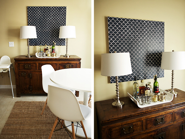
This week, I took on the challenge to paint something navy and found Benjamin Moore's Hale Navy to be the perfect shade.
Remember when I asked y'all which stencil to get from Royal Design Studio?
Remember when I asked y'all which stencil to get from Royal Design Studio?
Well, I chose the Moroccan Scallops, of course. I painted a square canvas in our breakfast area. Now, I am in love with the stencil, but my project isn't perfect so don't look too closely. I would recommend not using the stencil on canvas. Because of the natural texture and flex of a canvas, I was left with some bleeding paint.
I can't wait to use the stencil again though. I think I'll use the stencil on a wall -- maybe a stripe about 4 feet wide of scallops from ceiling to floor. A gray/white combo would be subtle and would probably look great. Maybe behind Avery's crib and flipped upside down? The lines would be much more crisp on a wall, no doubt.
I can't wait to use the stencil again though. I think I'll use the stencil on a wall -- maybe a stripe about 4 feet wide of scallops from ceiling to floor. A gray/white combo would be subtle and would probably look great. Maybe behind Avery's crib and flipped upside down? The lines would be much more crisp on a wall, no doubt.
In the meantime… enjoying the navy addition to our breakfast nook. This is fast becoming one of my favorite spaces in our home! What do you think?
Who knows… there may just be a stencil giveaway in the near future. Hint, hint! ;)
And once again, be sure to check out the others taking on the challenge with me!


24 comments:
Looks good, lady! I like that you're spreading the navy out...hmmm, maybe that's what I'll have to do for next weeks fabrics week. I haven't the first clue!
Oh my gosh. Pinned instantly. So in love with that canvas- and it looks perfect in your space. super jealous right now, i love the navy!
Oooh I'm loving the bit of graphic punch in your breakfast nook - it looks great over that cabinet!
This turned out amazing!!! I love it! You've got me rethinking the art I did this week :) And, totally digging your idea to run a smal section of it from ceiling to floor!
Well I think it looks great! What a good addition to your home.
Love that! So simple but really pretty. It's perfect for the space. Great job!
That is the best thing about art... it never has to be perfect! I like it! I also am loving your dining table!
I love how your stencil turned out. I have a love/hate relationship with stencils as I've been working on one in my powder room for what seems like a decade. Single wall=good. Wrapping a stencil around a wall=big mistake.
yes ma'am! That sure does look fantastic!
i love it and hale navy is my favorite! that is the color i used on my son's walls, (well part of them). it's a classic and dark navy- your artwork looks amazing
What! That is awesome. I want to do that too even though you said it bleeds. Looks kinda cool to me, from what I can see anyway.
My playroom is the same color and I love it! Your room is beautiful and I love the canvas! Great job!
loving the navy canvas stencil print... i think it turned out great! it really pops against the nuetrals in your dining room!
That is gorgeous! It's awesome being able to make something like that. Great job! So inspiring! x
This turned out great! It looks pretty perfect to me!
It looks beautiful!! What a great way to add color and pattern to that wall!
That looks really cool Anna!
Love it! I tried the stencil on a canvas this week too but didn't end up using it. Hale Navy is a fave of mine, that is the color I used in my master. Your breakfast nook is gorgeous!
You know I can't get enough navy, ever! Love it!
What a lovely addition to this room. I love that you went with a square. The pattern and color are wonderful. I'm totally loving this. What an easy DIY project to spruce up a boring room. I may need to do this.
anica
Such a fun pop to your space! I'm sure it looks great up close too!
Champagne Lifestyle on a Beer Budget
Stenciling is difficult, but I LOVE this and it looks perfect! In fact I love everything about your breakfast area...the chairs, the buffet, the silver lamps, jute rug...
I'm obsessed! The scallops are amazing. You did such a great job. Don't worry, I didn't look too closely :)
This looks super chic and you did an amazing job with our Scallops stencil. Thank you so much for giving me a great project to share via Royal Design Studio!
Post a Comment